  1. Home
  2. Computing
  3. News

This Windows 11 update makes Start Menu much more desirable and usable again

Add as a preferred source on Google
The Dell XPS 13 on a table with the Start Menu open.
Digital Trends

The Start Menu has been the central element in Microsoft Windows for nearly three decades. Though loved initially for its resourcefulness, the Menu went through some debatable — I call them abhorrent — changes with Windows 8, but eventually returned to occupying less space in the interface with Windows 8.1, and then Windows 10 and 11. Despite the rescuing, it is still reeling under the damaging changes in the form of recommendations and random automatically populating lists that reduce it to a mere glorified search interface. However, Microsoft may now be looking to resolve these issues and bringing back a more simplified interface with an upcoming update.

Microsoft is testing a new interface for Start Menu on Windows 11, reducing the existing clutter of randomly interspersed apps and files. X user @phantomofearth, renowned for testing new features in Windows Insider builds, gave us a good look at the new interface in a detailed video walkthrough.

Hidden in today’s Dev/Beta CUs: a major update to the Windows 11 Start menu! It has a new, larger layout with everything on one scrollable page, with the “All” list below recommendations – which can FINALLY be turned off! Pinned list is now limited to 2 rows, but can be expanded. pic.twitter.com/JkP3V2I5g6

— phantomofearth 🌳 (@phantomofearth) April 3, 2025

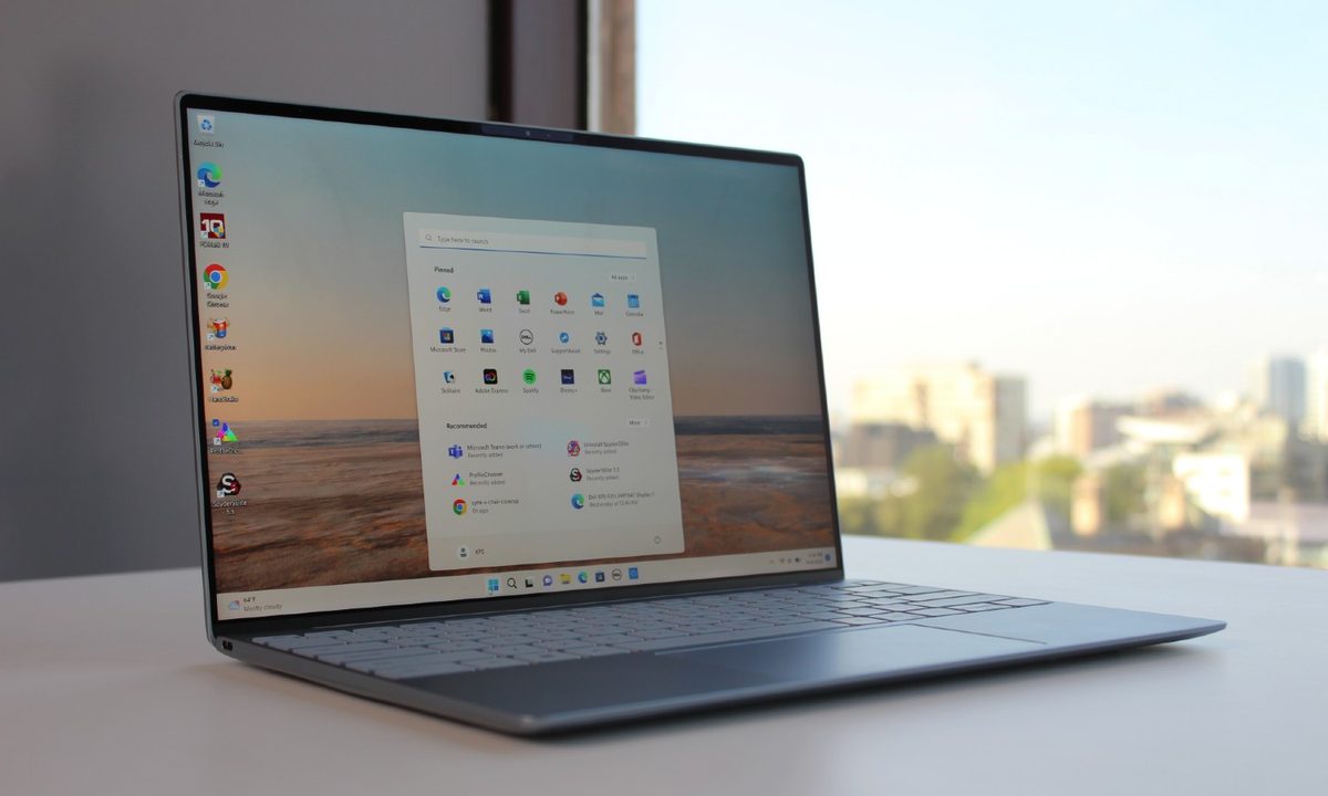
First off, the video shows that the updated interface rids away of the current split view that comprises Pinned and Recommended sections and merges them into a single section. It adds a third section labelled All, which lists every installed app, which was previously accessible by clicking the All button next on top of the Pinned section. These can be arranged into an alphabetical list or a grid with folders compiling apps based on their category.

Recommended Videos

The overhauled Start Menu also gets a vertically scrolling layout, so all your apps can be accessed through a single page with fewer button clicks or taps. In addition, the Start Menu also lets you hide recommendations entirely if you’d like it that way. The idea is to seemingly give Windows 11 users more control over the menu’s usability.

While it’s difficult for the Start Menu to return to its glorious Windows XP days, I expect some respite from the barrage of unwanted ads with these improvements.

These changes are coming to the latest Windows 11 Insider preview builds in the Dev and Beta channels, with build numbers 26200.5518 and 26120.3671, respectively. That means you can’t immediately access it unless you are part of those Insider channels.

Microsoft hasn’t officially made any announcements on when the new Start Menu interface will be available for stable channels — and whether it will be or not. However, with Microsoft’s Copilot event, along with the company’s 50th Anniversary celebration, lined up for early morning tomorrow, we can expect it to share some news.

Tushar Mehta
Tushar is a freelance writer at Digital Trends and has been contributing to the Mobile Section for the past three years…
Anthropic launches Claude design to simplify visual creation with AI
Finally, AI that designs your slides so you don’t have to
Claude

Anthropic has introduced a new AI-powered design tool called Claude Design, aimed at helping users create visual content such as prototypes, presentations, and marketing assets through simple conversational inputs. The product, developed under Anthropic Labs, is currently available in research preview for paid Claude subscribers and is being rolled out gradually.

Claude Design is powered by the company’s latest vision model, Claude Opus 4.7, and is positioned as a tool that bridges the gap between technical design expertise and everyday creative needs.

Read more
AI triggered a RAMmageddon so bad that Apple looks like the sensible choice
Laptop prices got so stupid in 2026, that Apple turned into the value king.
Student using MacBook Neo in classroom.

I really didn't want to believe it, but here we are. Apple is now looking like the sensible laptop brand. Not the cool underdog. Not the affordable alternative. Apple, in 2026. The reason is not that the company suddenly became generous, but rather the rest of the competition has suddenly become so deranged that a MacBook lineup starting at $599 feels weirdly grounded.

Apple's MacBook Neo starts at $599, while Microsoft's own 13-inch Surface Laptop now starts at $1,199 after this month's price hikes. This isn't a small gap that you can ignore. Meanwhile, Apple's MacBook Air with M5 starts at $1,099 with 16GB of memory and 512GB of storage, which looks like one of the few premium laptops still priced by human beings.

Read more
AI mode in Chrome gets a big upgrade to save you some tab hopping
Chrome just made tab hopping a thing of the past with its upgraded AI Mode, and it's genuinely useful.
Google AI mode mockup showing new feature

If you have ever gone down a rabbit hole while searching for something online, you know the drill. You open one tab, follow a link, open another, and another, and suddenly you have 14 tabs open and zero answers.

It was one of the reasons that forced me to switch to Arc Browser, which offered easier-to-manage vertical tabs, which, incidentally, Google Chrome also added a week back. But Google is not stopping there, and is adding a meaningful upgrade to AI Mode in Chrome to fix this issue.

Read more