
Yesterday, Apple unveiled iOS 7, and it’s not just impressive; it’s precisely what it needs to be. It’s fresh, new, and surprising. Like they always do, Apple fans will clamor to update their iPhones come fall, but for the first time in years, they have reason to be genuinely excited by what they receive. Until now, the only real surprises iPhone users have gotten came as small hardware upgrades every two years. But now, the most important part of the iPhone is changing. Considering how much flack Apple has received since the iPhone 5 launched last fall, iOS 7 almost feels as if it was released by a different company – one that isn’t run by a design team obsessed with shiny buttons, felt game tables, and bland sliding unlock screens.
If it feels like someone new designed iOS 7, that’s because someone did. Jonathan Ive, the design guru in charge of Apple’s physical hardware for more than a decade was promoted last fall and is now in charge of software, as well. For the first time, the lead designer of the iPhone and iPad can complete his vision.
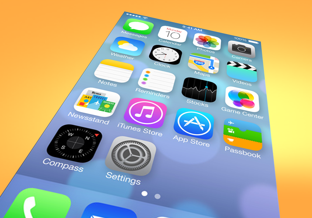
![]() This new iOS is an acknowledgement by Apple: Sometimes you need to fix what isn’t broken. There is little that doesn’t work with older versions of the iPhone and few of these new features or design elements are radical departures from the past. But they’re different enough; they look new, and at times, they work a little differently. For the first time since 2007, when someone walks into a phone store and looks at an iPhone, they’ll see a phone that’s different on its surface. Android phones come out every few months, and the manufacturers routinely change up the designs and interfaces. In a market like this one, the appearance of change – or a changing appearance – is as important as anything else. People buy new phones every two years; they want something new. With iOS 7, Apple stops resting on its laurels and proves that it can innovate with more than just its hardware.
This new iOS is an acknowledgement by Apple: Sometimes you need to fix what isn’t broken. There is little that doesn’t work with older versions of the iPhone and few of these new features or design elements are radical departures from the past. But they’re different enough; they look new, and at times, they work a little differently. For the first time since 2007, when someone walks into a phone store and looks at an iPhone, they’ll see a phone that’s different on its surface. Android phones come out every few months, and the manufacturers routinely change up the designs and interfaces. In a market like this one, the appearance of change – or a changing appearance – is as important as anything else. People buy new phones every two years; they want something new. With iOS 7, Apple stops resting on its laurels and proves that it can innovate with more than just its hardware.
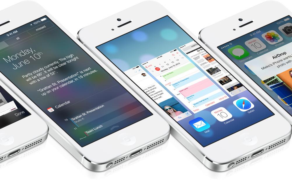
iOS 7 is modern, colorful, and gorgeous. The interface is flatter, but also has more depth thanks to a new 3D parallax effect that uses the iPhone or iPad accelerometer to produce a moving background. Slight transparency also adds layers to many menus. And the new design is extensive enough that Apple redesigned 10 of its core apps. In must cases, the changes simplify the look of the apps, removing excessive design elements like skeumorphism, a design philosophy that relies on realistic looking textures to “humanize” interfaces. That’s how we wound up with a Notes app that looks like a legal pad and a calendar that looks like it belongs on Ron Burgundy’s library. Those elements were the legacy of Scott Forstall, the man Ive replaced, and the subtle butt of numerous jabs taken during Monday’s keynote by Apple’s Senior VP of Software Engineering, Craig Federighi. Ive, a vocal opponent of such design, has definitively removed any trace of it from iOS 7.
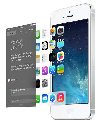 Everything about iOS 7 will be familiar enough to anyone who’s used an iPhone, and most of it will still work intuitively, but – in this writer’s opinion – it will look and work better. For example, if you go to create a folder, you’ll be able to add as many apps to it as you want because folders now have pages. Or say you want to double tap the Home button to multitask. Now, when you enter the multitasking menu, you get a large card interface that allows you to easily swipe between open apps. The notification drawer now simpler and easier to use, with a view that lets you see everything you have going on today. Gone is the endless scroll of every photo you’ve ever taken, replaced with a photo gallery that organizes itself based on the time and location that an image was taken.
There are completely new features, too. Swipe up from the bottom of the screen and you bring up a Control Center menu, which lets you toggle essential functions like screen brightness, Bluetooth, Wi-Fi, screen rotation, volume, as well as access a few key apps like the calculator, flashlight, maps, and the camera. A button to use AirDrop – a new function that lets you wirelessly share files with other iPhone users – is also in the Control Center. Though some versions of Android have drawers like this, we’ve never seen one so well put together; Ive’s Control Center is far more elegant than the one Google added to Android last fall.
Did we mention that Siri’s voice is less shrill? That’s the real killer feature.
But iOS 7 isn’t about the features – not really. They’re there, they’re interesting, and they add to the overall package, but this redesign is really about the packaging. There are times when you need to upend the table and throw everything out, and there are times when seemingly skin deep changes are exactly what’s called for. Despite being only six years old, the iPhone was still one of the best devices in its class. After Monday’s announcement, it doesn’t just have the best apps and the smoothest running OS – it looks like the newest phone on the market.
With a growing sea of cheap (or free) but decent Android phones to compete with, Apple needed to give people a reason to be excited about the iPhone. Today, it gave us dozens.