Over two decades ago, Apple introduced Aqua, a whole new design language for macOS. On stage was the company’s charismatic co-founder and chief, Steve Jobs, who famously said that Aqua was designed with so much flair that you would want to lick the buttons appearing on a Mac’s screen.
25 years later, Apple introduced the new Liquid Glass design identity for the entirety of its software portfolio. And it immediately stirred a heated debate. Some said if Jobs were alive, he would love it. Others argued that he would fire the entire team behind the aesthetics.
A few even argued that the company was playing the “psychological freshness” game to cover up its failures with meaningful AI-driven experiences. It was rare for an Apple idea to be so divisive. Liquid Glass is eye-catching, without an iota of doubt, but it also poses legitimate issues. iOS 26.1 finally fixed those for me, and then some more.
Liquid Glass is less vexing, at last
“When you design a new user interface, you have to start off humbly. You have to start off saying, what are the simplest elements in it? What does a button look like? And you spend months working on a button.” That was the line when Job introduced Aqua. With Liquid Glass, Apple missed the mark right at the fundamentals – buttons.
The dynamic color adjustment of the glass-inspired buttons as you scroll through the iPhone’s UI is stunning to witness, but not without its missteps. You see, the whole design language is dependent on what’s in the background, and whether you have enabled light or dark mode.
Even with the native spots such as the notifications drawer, a bright wallpaper in light mode simply made the banner text unreadable. In dark mode, even scrolling past the images in the Photos app or webpages in Safari often created a jarring bright/dark transition on the buttons.
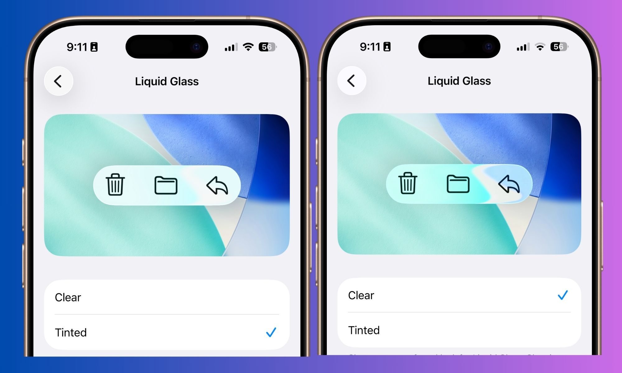
Apple took the feedback and made subtle changes during the beta testing phase, but it didn’t fix the whole problem. In iOS 26.1, Apple is finally giving a permanent fix – you can either keep it, or switch from the see-through glass effect to a frosted look.
Apple calls it Clear or Tinted, and you can access it in the Display & Brightness section of the Settings app. Now, I’ll have to say that the Tinted look doesn’t look nearly as futuristic as the Clear option, but it’s a lot more coherent across the whole UI.
It’s still not the full solution, but definitely a step in the right direction. Take, for example comparison below. Even with Tinted mode enabled, the pill-shaped controls at the bottom still invert the background and text color based on the image behind them.
If the photos have a white background, the text inverts to black automatically, and so does the pill-shaped bar. It doesn’t matter whether you have dark or light mode enabled, the inversion happens regardless. It’s a thoughtful design idea, but non-uniform execution.
Apple wouldn’t have to go through the hassle in the first place if Liquid Glass weren’t a thing in the first place, so there’s that. But I’d still take whatever flexibility users are getting with Clear and Tinted presets over having none.
Begone, accidental camera activations!
I have lost count of the instances where my iPhone’s camera was accidentally triggered from the lock screen. I’ve often taken the phone out of my pocket to see the camera app active after the display registered an accidental left swipe on the lock screen.
With the camera app, the battery took a hit, and further unintended taps clicked way too many dark pictures within the confines of my jeans pocket. It’s annoying because I already have a dedicated camera button set as a shortcut on the lock screen.
It even broke the flashlight experience. If you’ve turned on the LED flash from the lock screen, any unintended swipe would launch the camera and turn off the flash. I’ve run into this frustrating scenario on a healthy few occasions.
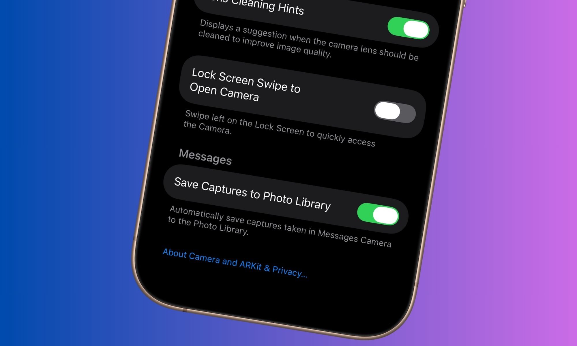
Well, the annoyances are coming to an end, at last. Apple is finally letting users disable this behavior with the iOS 26.1 update. In the Camera section of the Settings app, there’s now a new toggle for Lock Screen Swipe to Open Camera.
It’s a huge sigh of relief. “Why it took them way over a decade to give us this option is beyond me,” wrote one user on Reddit. I totally agree with you, random iPhone-using stranger who shares his hot takes on Reddit. I totally get it!
Say hello to nice swipes
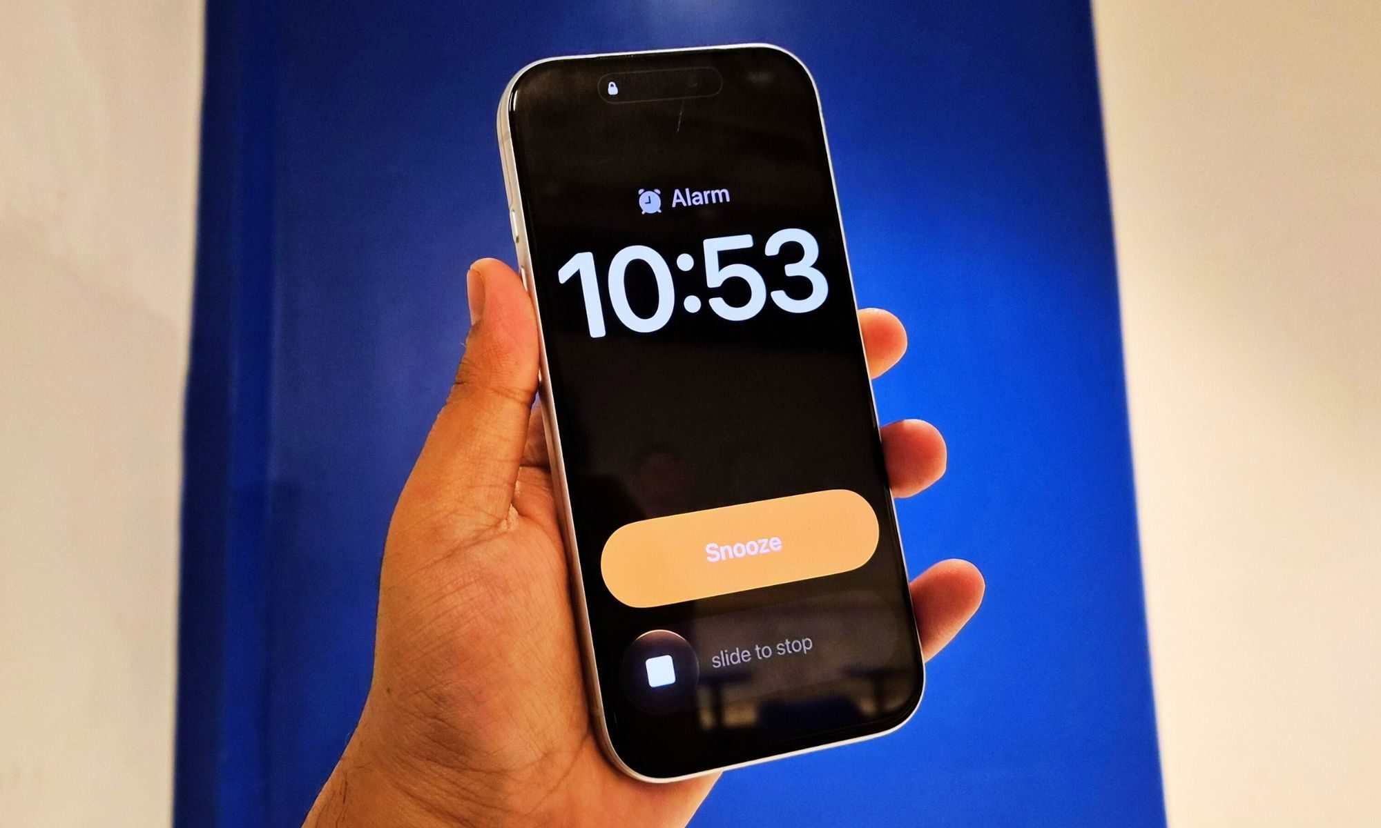
One of the nicest things about iOS 26.1 is that it focuses on fixing papercuts rather than adding dozens of flashy new features. One of those changes is changing how you handle alarms.
I am one of those people who frantically tap on the screen, in a half-dazed state, every time a loud alarm wakes me up. Finding the on-screen button with eyes only half open doesn’t help the cause.
After installing the iOS 26.1 update, those struggles should come to an end. Apple has changed the lock screen design of the alarm alert, adding a new slider for silencing the alarm.
I love the convenience, and so would any person who wants to start their morning with moments of zen control, instead of a loud gizmo giving them a literal rude awakening.
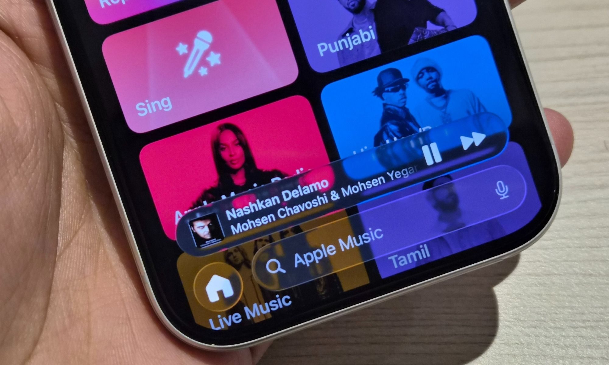
Talking about swipe-based gestures, Apple Music is also joining the bandwagon. You can now swipe on the pill-shaped mini player at the bottom of the screen to switch back and forth between tracks.
Overall, I am loving the subtle refinements that iOS 26.1 has introduced. I am now looking forward to the changes coming with iOS 26.2, which just got its first developer beta and adds new tricks such as expanded sleep score, chapters in Apple Podcasts, and a fresh look within the News app.