
Now that the year is starting to wind down, all the major flagship smartphone launches of 2024, including Apple’s iPhone 16 line, are behind us.
As an iPhone user for over the past decade, I found the iPhone 16 launch exciting, as Apple finally gave us some of the best darn colors for the base model in quite some time. And don’t forget that the base models also got quite a few features previously exclusive to the Pro models, like the Action button, a two-year jump in power with the A18, and the new Camera Control button that’s on all iPhone 16 variations.
Camera Control is one of the features of the iPhone 16 series that I was most excited about, and I’m still pretty happy that we got it. But there are also some things I feel Apple got wrong with the Camera Control, at least in its current state.
The position is awkward
Last year, the Action button replaced the old silent/ring switch above the volume buttons. This year, Apple added the Camera Control, an entirely new button that hasn’t replaced anything prior.
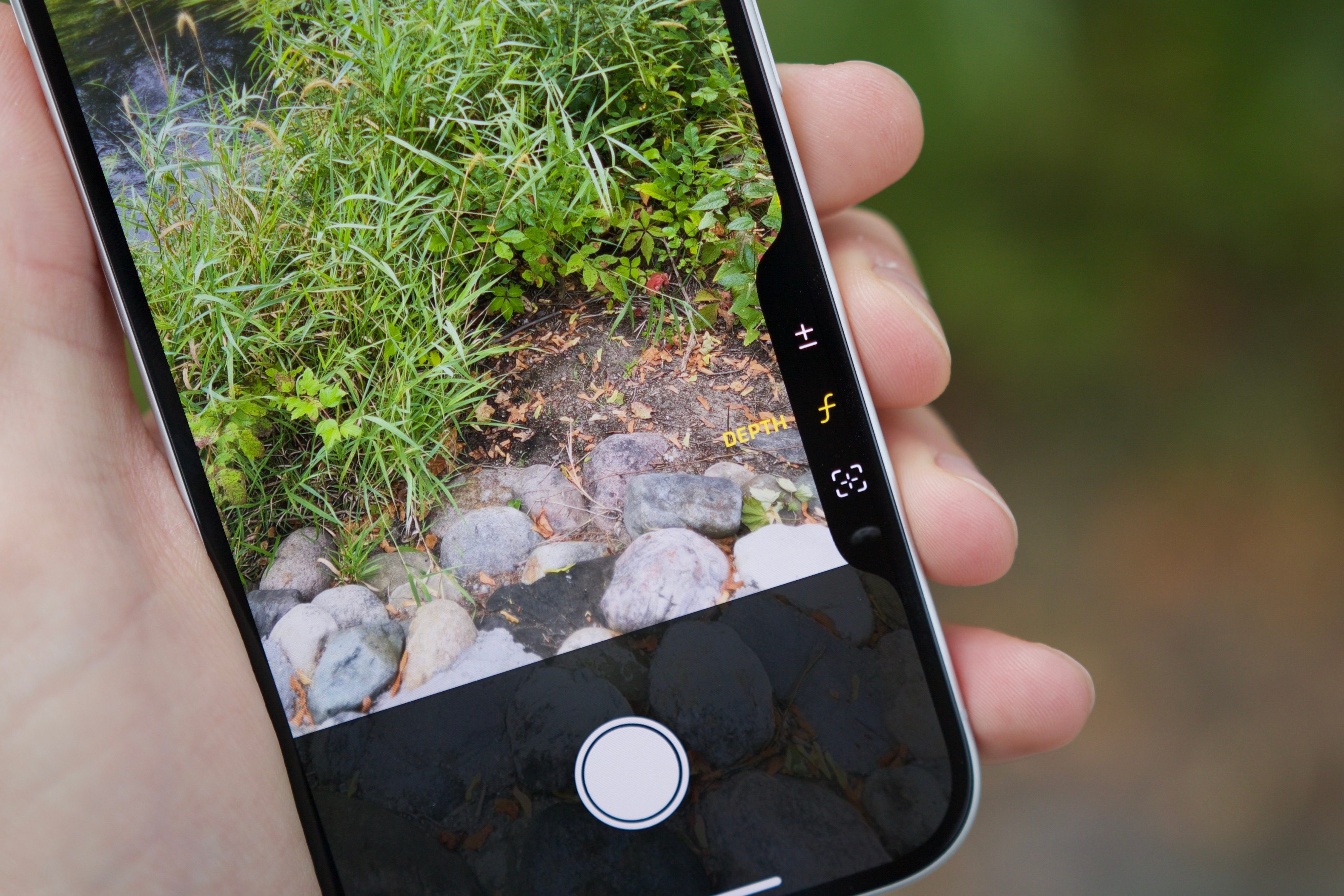
Right now, on the iPhone 16/Plus/Pro/Max, the Camera Control is flush with the right side of the flat frame on the lower half. It’s not quite at the bottom; it’s just a bit below the halfway point.
After using the Camera Control, I’m not a fan of its placement on the iPhone 16. I’ve often pressed the button unintentionally when picking up my phone from a table, which is annoying because it can unlock the phone when I don’t intend to use it (due to my Apple Watch).

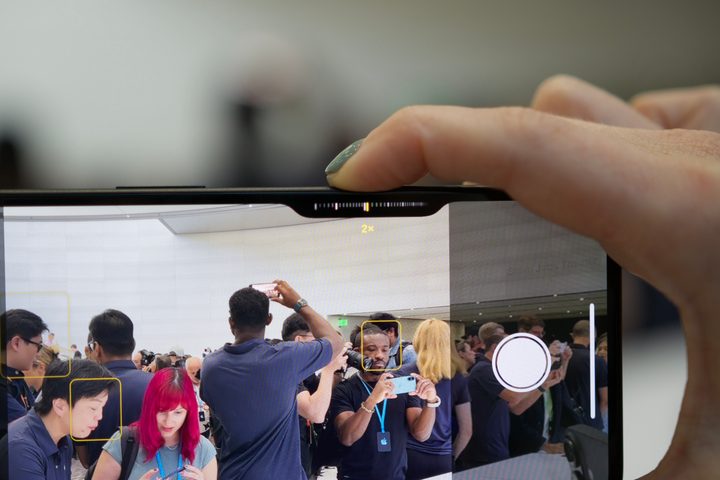
Another thing that I’ve noticed is that the current position is a little too far in to use comfortably for landscape photos. When I use it for landscape orientation, I have to have my fingers obstructing the screen to reach it with my index finger. If I use the touch screen control, I have my index and pinky fingers at the top and bottom and use my thumb, which is the easiest method. Camera Control requires me to adjust how I hold the phone to take a photo or video.
For portrait photos, the position seems to work (as long as you’re right-handed). I find it’s a bit easier for me to at least get selfies, though that gets me to my next point: the force needed to press it.
A physical button means camera shake
Prior to the Camera Control button, there were two options for taking a photo: use the touchscreen shutter button or the volume up button. I never used the volume button to take pictures; I just used the onscreen shutter button.
However, since Apple debuted Camera Control, I have been eager to use it as a shutter button. My eagerness faded a bit as I realized how much pressure was needed to actually click the button, which can cause camera shake. We all know what happens to a still photo when there’s even the slightest bit of movement (especially lowlight photos): blur.
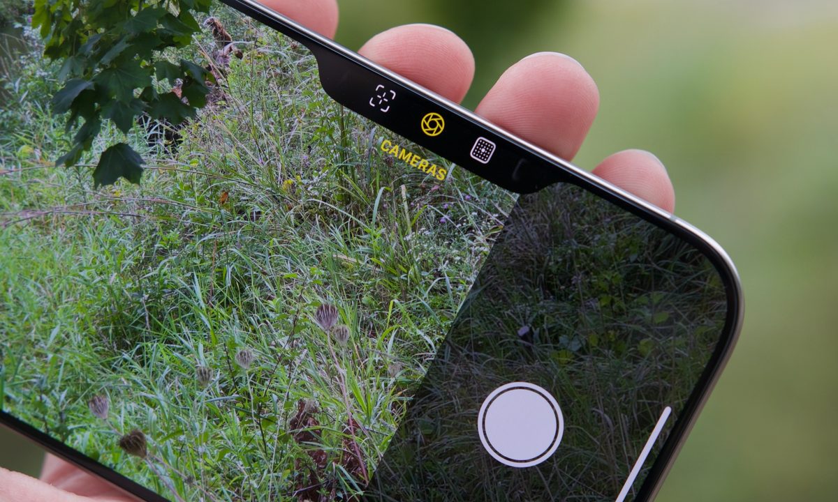
One press of Camera Control launches the Camera app, and another press will capture a photo. A press and hold starts recording. A double half press lets you go through the various settings, and a single half press enables you to select a different setting. Sliding your finger along the Camera Control will adjust the setting with a slider.
I found Apple’s default setting for Camera Control to require too much pressure, and I hated using it because it would result in slight movement during capture, making the image out of focus or blurry. Adjusting the button sensitivity helped a bit, but there is still a bit of camera shake, especially if I try using it one-handed. Sometimes, I just find it easier to stick with the touchscreen shutter button.
A fun addition with growing pains

The Camera Control button was the biggest feature that I was looking forward to, but I can’t help but feel slightly disappointed with it. Is this similar to the MacBook Touch Bar, except for the iPhone?
Don’t get me wrong; I still like to use the Camera Control to at least launch the Camera app. I was previously using the Action button to do that same action. But now, with Camera Control, I can use that to quickly get to the camera, which opens up the Action button to something else.
Perhaps I’m overthinking using the Camera Control as a dedicated button for all my camera needs. During the keynote, it seemed like Apple intended for the Camera Control to be primarily for Visual Intelligence, which I see as a good placement for such a feature. But since the iPhone 16 launched without Apple Intelligence features out of the box, it just feels a bit off.
I hope that Apple considers adjusting the placement of the Camera Control in the next few years to make it less awkward to use. It really should be further down, closer to the bottom than it currently is. Perhaps having the ability to do a haptic touch to press it could help with the annoying camera shake issue.
I want to see Apple improve the Camera Control over time rather than eliminate it like an afterthought, as it did with the Touch Bar. There’s a lot of promise and potential here — it just needs some fine-tuning.


